
At this stage we knew we were going to have to redesign the User Interface (UI). Our version 1.0 was feature rich and doing pretty much exactly what we needed it to. We could see from how new users interacted with it though, that it wasn’t intuitive enough. We needed a design that led the new user through how to use it without needing any training or explanation.
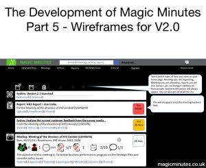
So we looked at all the different cloud services we liked and didn’t like and started to think about a better way. We designed our mock ups in PowerPoint and used the animation to show what happens when different elements were clicked.
It was better than we had, but we were clearly no experts in this stuff. It had served to whet our appetite – but next we were going to have to call in the professionals.
In Part Six – Selecting a Designer
Recent Comments